Two-Tone Cabinets: How to Make the Statement Work
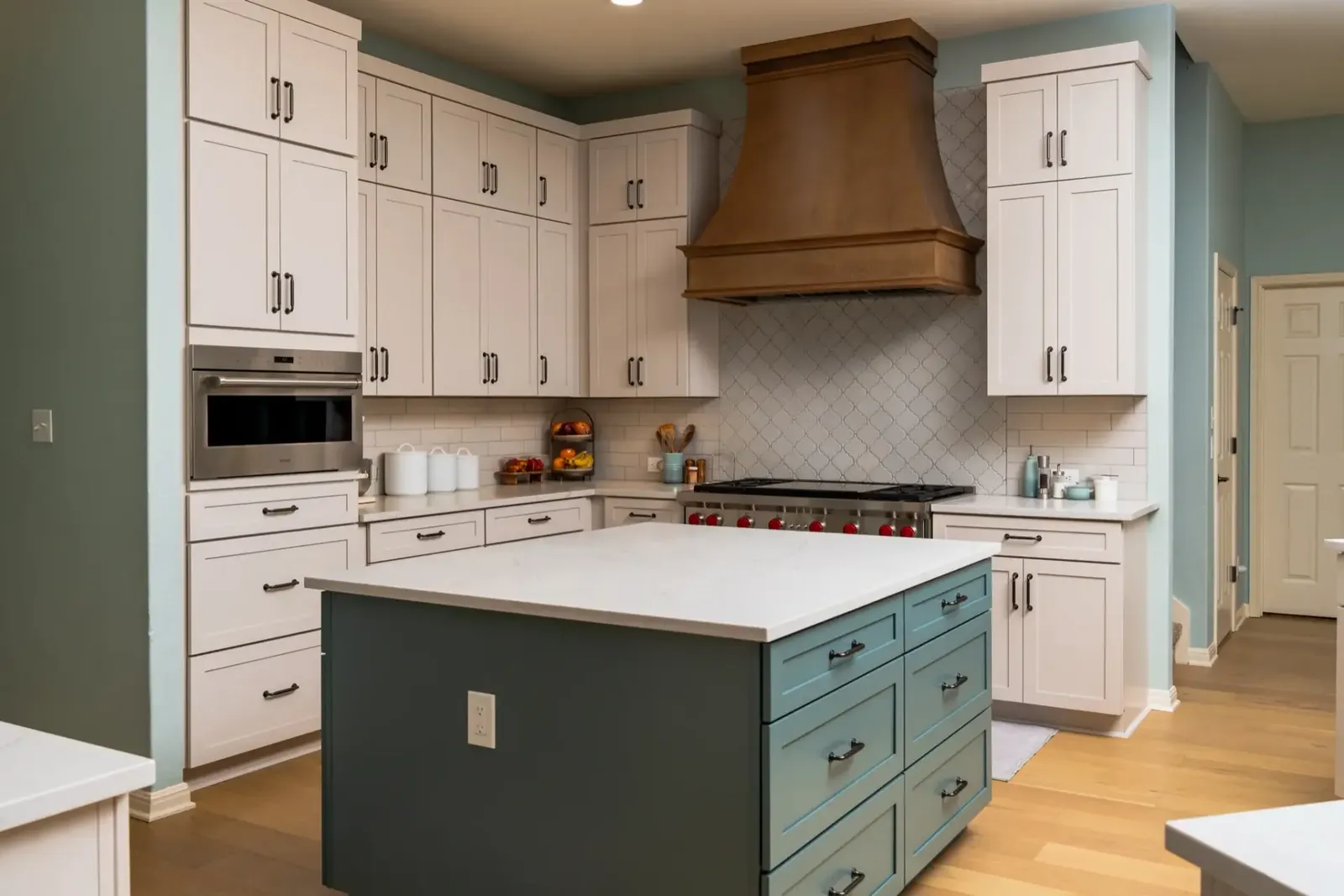
Two-tone kitchen cabinets pair two colors or finishes in one room. The most common version puts lighter cabinets on the walls and a darker color or warm wood below. Another sets the island apart from the perimeter. Either way, the contrast gives the kitchen depth and a clear focal point.
The look has staying power. In the 2026 Houzz Kitchen Trends study, 24% of renovating homeowners chose contrasting upper and lower cabinets. That's roughly one remodel in four.
Getting it right takes more than picking two colors you like. Placement and the surfaces around the cabinets decide whether the result looks planned or patchy. The eight combinations below come from finished projects in the two-tone kitchens collection, along with the choices that make each one work.
What are two-tone kitchen cabinets?
Two-tone kitchen cabinets use two distinct colors, two finishes, or one of each in the same kitchen. The split usually follows the layout, so each tone has a clear zone. Most designs use one of these:
- Upper cabinets in one tone, lower cabinets in another.
- The island in a contrasting color or wood, with matching perimeter cabinets.
- One tall wall, such as a pantry or oven column, in a different finish.
- A single feature piece, such as a hood surround or a hutch.
The first two are by far the most popular. The tall wall works well in open plans, where the kitchen needs one strong backdrop that reads from the living area. A feature piece is the lightest touch and suits kitchens that are mostly one color.
The second tone doesn't have to be a paint color. Wood against paint is one of the most common versions, and two wood species can work too. What matters is that the difference is clear enough to look deliberate.
Are two-tone cabinets still in style?
Yes, and the numbers back it up. The same Houzz study found wood has overtaken white as the top cabinet color, at 29% against 28%. Two-tone designs sit right in the middle of that shift, because they let homeowners bring in wood without giving up a bright kitchen.
Among kitchens with contrasting cabinets, white leads the uppers at 40%. Wood leads the lowers at 37%, followed by blue at 19% and green at 14%. So the most common modern version is simple: white up top, wood or a deeper color below.
What has changed is the mood. Earlier two-tone kitchens leaned on gray and stark black-and-white contrast. Today's versions tend to be warmer, with wood tones, soft greens, and creams doing more of the work.
Where the darker color should go
Dark below and light above is the safest starting point. Wren Kitchens design director Darren Watts told Homes & Gardens that a darker lower color with a lighter one up top creates the illusion of a larger room.
There's a practical reason as well. Lower cabinets take the most scuffs and fingerprints, and darker finishes and wood hide that wear better. That's why most two-tone kitchen cabinets keep the lighter shade up high.
Light matters too. A kitchen with small windows can keep the dark tone to the island only. A sunny room can handle darker lowers along every wall.
Ceiling height plays a part as well. Light uppers make a standard 8-foot ceiling feel less close. In compact rooms, this matters even more, which is why so many small kitchen ideas keep the walls pale.
The rule can flip on purpose. Dark uppers over light lowers can work in a tall room with plenty of daylight. It's a bolder choice, though, and it needs more careful planning to avoid feeling top-heavy.
Choosing materials & finishes for each tone
The finish on each tone affects how the kitchen looks day to day, not only in photos. It also changes how much upkeep each zone needs.
Paint, stain, or one of each
Painted cabinets give you the widest color range, from bright white to deep navy. Stained wood shows the grain and adds texture that paint can't. Pairing one painted tone with one wood tone is the easiest way to get contrast that feels natural, since the two finishes already look different up close.
Two painted colors can work well too. In that case, pick colors with a clear difference in lightness. Two mid-tones side by side often read as one muddy color from across the room.
Matte or gloss
Matte finishes hide fingerprints and suit busy family kitchens. Gloss reflects light, which helps a darker tone feel less heavy in a smaller room. Mixing the two can add interest, though one sheen across both tones usually looks calmer.
How much choice each cabinet tier gives you
Your cabinet line affects how far you can push the combination. Stock cabinets come in popular door style and color combinations, which covers most classic white and wood pairings. Semi-custom lines add more finishes and sizes. Custom cabinets offer unlimited door style and color combinations, which helps when you want an exact shade of green or a specific stain.
8 two-tone kitchen ideas from real remodels
Every pairing below uses the same placement logic. What changes is how much contrast you want and where you want the eye to land.
1. White uppers over natural wood lowers

White uppers over natural wood lowers combine the two most popular cabinet colors in the Houzz study. White keeps the walls bright, and wood adds warmth at hand height, where you see it most. Medium and light stains suit two-tone white and wood kitchen cabinets best, since they contrast with white without feeling dark.
White oak cabinets are a popular choice for the lower run. Pair them with a white or warm white countertop so the wood stays the focus.
2. A light island in a darker kitchen

Most two-tone islands are darker than the rest of the kitchen. Flipping that works just as well. A white or light island set against dark or wood-toned perimeter cabinets brightens the middle of the room, right where you prep and gather.
This two-tone kitchen island approach suits kitchens with plenty of wood or black cabinetry that could feel heavy without a break. A light island is also easier to see as a separate piece, which is why the reverse contrast shows up in many kitchen island ideas for larger rooms. Match the island countertop to the perimeter counters so the two zones still feel connected.
3. Navy lowers with white uppers

Navy gives strong contrast without feeling as heavy as black. It pairs well with white quartz and brushed brass or nickel hardware.
Keep the navy on the base cabinets so the room still feels open at eye level. A white or light gray backsplash keeps the line between the two tones crisp.
4. A green island or green lowers

Green has become a common pick for lower cabinets. Sage reads soft and works with light wood floors. Deeper greens look richer and suit brass hardware.
If you're unsure, test it on the island first. Green also pairs well with natural wood open shelves, which bring the two tones together on the wall.
5. A black island with white perimeter cabinets

Black gives the sharpest contrast of any pairing. It looks best on a larger island in a room with good daylight.
A light countertop on the island keeps the black from feeling too dense. Repeating black in the light fixtures or faucet helps the island look connected to the rest of the room.
6. Two shades of the same color

Light gray over charcoal is a quieter way to go two-tone. Because both shades come from the same family, the contrast feels gradual rather than sharp.
This approach suits homeowners who want depth without a bold color. It also works next to a busy backsplash or a patterned floor, where a strong contrast would compete.
7. Cream with warm wood

Cream sits closer to wood than bright white does. The result is a softer contrast that still reads as two tones.
It works especially well in traditional homes and with natural stone countertops. Unlacquered brass or aged bronze hardware suits this palette better than chrome.
8. A wood tall wall beside painted cabinets

Running one tall wall in wood breaks up a long painted kitchen. It also hides the fridge and pantry behind one continuous finish.
The painted cabinets then frame the work zone, and the wood wall becomes the backdrop. Panel-ready appliances make this look cleaner, since nothing interrupts the wood.
Details that tie both tones together
Two-tone kitchen cabinets only look intentional when the rest of the kitchen connects them. These details make the biggest difference.
Hardware
Use one hardware finish across both tones. In the same Homes & Gardens piece, Caple's Doug Haswell recommends the same cabinet handles throughout to unify the space.
Matte black reads clearly on white and on wood, which is why black hardware styling shows up in so many of these kitchens. Brass suits navy, green, and cream. Brushed nickel works with gray and blue.
Countertops
Let the countertop bridge the tones. A quartz or quartzite slab with veining in both colors links the uppers and lowers. With two-tone white and wood kitchen cabinets, a warm white stone with soft beige veining does this well.
Houzz found 21% of homeowners choose different surfaces for the island and the main counters. On a two-tone island, a different top adds even more contrast. Just keep both stones in the same color family.
Backsplash
The backsplash sits right between the two tones, so it carries a lot of weight. A white or light tile keeps the line clean. A tile with a little of each cabinet color in it works as a bridge.
Flooring & lighting
Keep the floor a different value from the lower cabinets. Wood lowers over a wood floor of the same tone tend to blend into one surface.
Pendants over a two-tone island are a good place to repeat the accent color or the hardware finish. Under-cabinet lighting also helps the darker lowers read clearly at night.
Appliances
Stainless steel suits almost every two-tone pairing, since it sits between light and dark. Black appliances blend into black or charcoal lowers and look cleaner there than against white. Panel-ready appliances take the cabinet finish, which keeps a wood wall or a painted run uninterrupted.
Where the colors meet
Change colors at a natural break. The strongest two-tone kitchens switch tones at an end panel or a tall appliance. A color change in the middle of a run looks like a mistake.
How to choose the right combination for your kitchen
The best pairing depends on your room as much as your taste. A few questions narrow it down quickly.
- How big is the room? Larger kitchens can take strong contrast, like black lowers or a deep green island. Smaller kitchens do better with lighter uppers and a softer lower tone.
- How much natural light does it get? North-facing rooms and kitchens with small windows need lighter shades overall. Rooms with plenty of sun can handle navy or charcoal.
- What style is the rest of the house? Modern homes suit flat-panel doors with high contrast. Traditional and farmhouse homes lean toward shaker doors, cream, and warm wood.
- What's staying? Existing floors, countertops, or appliances limit the palette. Pick cabinet colors that work with whatever you're keeping.
Before you commit, look at full-size door samples in your own kitchen. Check them in morning light and under your evening lights. Colors on a small chip rarely look the same on a full run of cabinets.
Why planning & installation matter more with two tones
Contrast shows every flaw. On a one-color kitchen, a slightly uneven gap between doors is hard to spot. When the doors switch from white to wood, the eye goes straight to that line.
That's why the transition points need to be planned before anything is ordered. End panels, fillers, and trim should match the tone they belong to. The reveal between tones should be even along the whole kitchen.
Measurements matter here too. A small error in a cabinet run can push a color change off a natural break and into the middle of a wall. Careful measuring and a detailed design check before ordering prevent that.
Color consistency is the other risk. Ordering every cabinet in one tone at the same time keeps the shade even. Adding a cabinet later in the same color can leave a slight mismatch.
Two-tone kitchen cabinets FAQ
What color should the island be in a two-tone kitchen?
Usually the darker or warmer of your two tones. A wood, navy, green, or black island set against white perimeter cabinets is the most common version. If the room is small or dark, a mid-tone wood keeps the contrast softer than black.
Do two-tone cabinets work in a small kitchen?
Yes, as long as the lighter tone goes up high. Light uppers keep the walls feeling open, and a darker lower run adds depth without closing the room in. A soft contrast, like cream over light wood, works better here than black and white.
Should the hardware match on both tones?
In most kitchens, yes. One finish across both tones makes the two colors look like one design. Mixing finishes can work, but only when each finish has a clear role, such as appliance pulls in a different metal.
How do you pick two colors that go together?
Start with a clear difference in lightness, since two mid-tones tend to blur together. Then check both colors against your countertop and floor samples at the same time. If all of them look good side by side in your own light, the pairing will hold up on a full kitchen.
Mistakes to avoid
A few choices tend to undo the look:
- Adding a third and fourth color. Two tones plus a neutral wall is plenty.
- Matching the floor to the lower cabinets. They blend together, and the cabinets lose their shape.
- Picking colors from small chips instead of full-size samples.
- Mixing hardware finishes between tones, which splits the kitchen into two separate rooms.
Plan your two-tone kitchen with Cabinet IQ
Two-tone kitchen cabinets reward careful planning. Where the colors split and where they meet both need to be settled before anything is ordered.
At Cabinet IQ, we start with a free consultation and show both tones together in a 3D rendering, so you can see the balance before you commit. You can compare stock, semi-custom, and custom cabinets side by side and choose the line that fits your colors and budget.
Every design also passes our 57-point design Quality Assurance Check before ordering, which is where transitions, panels, and measurements get confirmed. Our team fabricates and installs your countertops in house, so the stone that ties your two tones together is handled by the same people. You'll find plenty of finished examples in our project gallery.
Start planning now, and you'll have time to compare door samples before the new year. Book your consultation today. It's free, and you'll see your two-tone kitchen before a single cabinet is built.